Today are going to give you a little lesson about colors. Do you know about the color wheel? Probably, without being very aware of it, you have a favourite color with which you like to dress or paint, or complement your appearance without knowing very well why…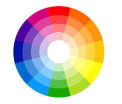
You probably have heard about “primary colors” and “secondary colors”, it is something that you study when you are little, but if you were not thinking about yourself doing something later in life related to art or design, probably you did not pay too much attention to it. Colors are part of our daily lives and their use in different elements and designs help us make decisions, much more so when it comes to buying a work of art.
In addition, there is the Chromatic Circle, which are the combinations of colors with a specific objective: Complementary: These combinations cause a great impact together. When this combination is used, the colors are much stronger and much more predominant. Monochromatic: These are 3 variations on a base color, each with a different tone. With this effect a soft and subtle combination is achieved and is used to achieve harmonious designs. Analogues: These are combinations of 3 colors that are next to each other on the color wheel. When to use it? When you want to generate a feeling of positivity and tranquility in users.

In addition, colors can be classified into: Warm colors: They are the ones in the middle of the circle, they transmit energy, warmth, closeness, enthusiasm, dynamism, joy and movement. For example, some warm colors are red, yellow and orange. Cold colors: The sensation they generate is one of cold, serenity, calm, remoteness and loneliness. Some examples of these colors are blue, green and purple.

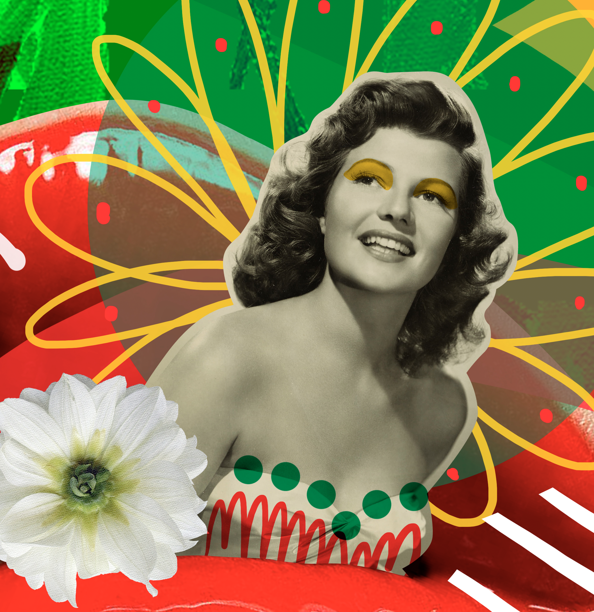
Kreislerart.com has plenty of works full of colors….And you, which is YOUR favorite color? Do you use colors with a purpose in your life?

- Opening Show - May 14, 2023
- TAMARA KREISLER Gallery - May 14, 2023
- Works full of love - February 12, 2023